Illuminating and Optimistic: The Colors of 2021

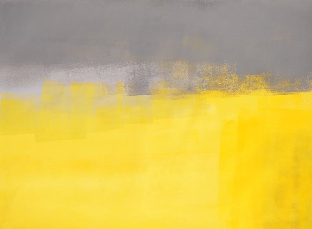
At the end of 2020, the Pantone Color Institute released two Colors of the Year for 2021: Illuminating, an optimistic yellow offering the promise of a sunny day, paired with Ultimate Gray, the first neutral shade to be selected, or dare we say unprecedented.

The Pantone Color Institute scours the globe noting developments in everything from fashion to politics to create a trend analysis representing the cultural attitude of the year to come. Illuminating and Ultimate Gray appropriately represent the concept of “a light at the end of the tunnel” or “a new dawn.” The colors are practical and solid while warm and optimistic.
Pantone’s Color of the Year reminds us of our emotional connections to color. Color theory plays a strong role in their selection of colors to represent moods and feelings. Our responses to color can influence how we experience a place or how we feel about a product. Since its initiation, Pantone’s Color of the Year has inspired product development, purchasing decisions, and has been known to create a ripple effect for years. This effect is best demonstrated in our favorite Devil Wears Prada scene, when Miranda describes how the first Pantone Color of the Year (2000), Cerulean Blue, became popular in luxury fashion then trickled down to fast fashion, including Andy’s sweater.
While not every color has the Cerulean effect, many are celebrated by brands, including home décor, cosmetics, kitchen appliances, fashion, and accessories. In recent years, Apple has incorporated Pantone’s Color of the Year into new iPhone releases to keep the product relevant and interesting to consumers with new color releases each year.
This year, Pantone’s colors are reminiscent of Bergmeyer’s new branding. Bergmeyer’s yellow was also selected because yellow emotes positivity, creativity, and optimism, representing our firm culture. The gray tones act as a foundation, and the yellow allows us to “highlight” our work.
Scroll through the slideshow below to see examples from Bergmeyer's brand refresh.


When it comes to interior design, will Illuminating realize the rumor that “Gen Z Yellow is the new Millennial Pink”? Yellow has been growing in popularity in recent years for print, fashion, and interiors (particularly with younger demographics) because of its energizing, joyful, and gender-neutral nature. Similarly, 2021’s Shutterstock Color Trends report, which annually publishes colors with increased image-download activity, included Fortuna Gold, a warm gold color representing chance happenings and happy coincidence. Named for Fortuna, the Roman goddess of good fortune, this color delivers the felicity and magic we all crave in 2020.

If clients are averse to yellow, designers should still consider incorporating what the color represents: happiness and optimism. Interior design has a history of reflecting the feelings of an era. In the 1950s, home decor and kitchens were bright to reflect the peace and joy people felt Post-WWII. Emphasis was placed on relaxation, and homes filled with renewed peace and prosperity were decorated more vibrantly. After the world spent so much of 2020 in quarantine, there is hope that Post-COVID spaces and environments trend more vivacious to celebrate a new dawn of health and happiness.
Whether designers embrace the actual Pantone Colors of the Year or the spirit of the colors, we will see more vibrancy as hope and positivity are sprinkled into interiors, products, and marketing in 2021 and beyond. In a year as gray with uncertainty as 2020, we’re eager for 2021 to illuminate us all.