Unlocking the Secrets of Legacy Brand Logos: Valuable Insights from the Evolution of Famous Marks Over Time

Brand encompasses many things - photography style, use of color, tone of voice, and typography - to name a few. But perhaps the biggest marker of a brand to this day remains the logo. We all have our favorites, and we all have our opinions when rebrands make headlines.
(Twitter-turned-X, we're looking at you).
There's something to be said for a true classic — a bold red lip, or your grandpa's favorite car. Some things just never go out of style. No one knows this better than Coca-Cola. Since 1905, their signature hand-lettered wordmark has remained more or less intact, as well as their use of that bright, cherry red. With such a long-standing brand history, they've become almost synonymous with all things Americana. And their loyalty to the branding builds ownability over time — aka we need less and less visual information as a consumer to associate a product with a brand.
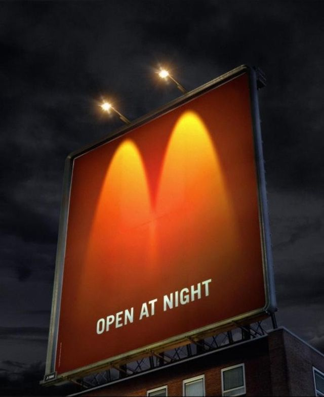
McDonald's is another classic example. I personally can't see red and yellow together without thinking of road trips with my family as a kid. The golden arches act as beacon, immediately recognizable to people across the globe. They've distilled their brand to such a focused extent that we recognize McDonald's even when most of their mark is obscured.

Apple is another, more recent example. Since 1977, their bitten apple icon has become a global symbol of tech. The crisp, simple mark has led Apple in their continuation of minimalistic, accessible branding which can be seen in everything from their packaging to their stores.
The benefit of remaining true to a logo is brand credibility. We feel a natural affinity for brands we grew up with, and their consistency is somewhat of a comfort in an ever-changing world. These brands become something we can rely on. Just as much, they remain relevant in the cultural zeitgeist. When it comes to scalability, a heritage mark is a universal language.
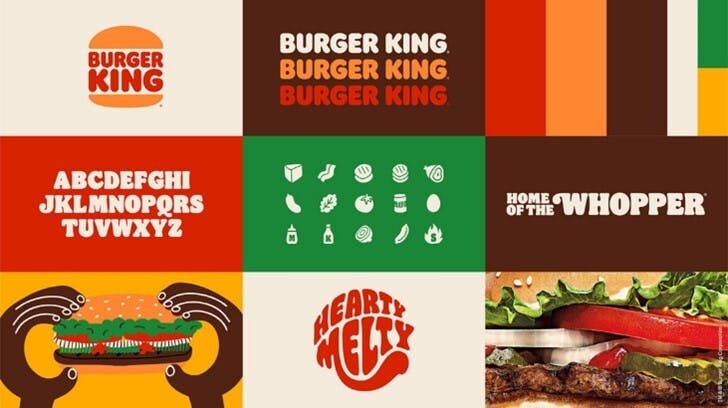
However, nostalgia and credibility aren't only reserved for brands that have remained more or less visually unchanged. Sometimes, this is the very thing that might motivate a brand to dawn a new (or should I say old) mark. Take Burger King for example, who fell into the trend of the glossy 3Dificatication that was trademarked around the early 2000s. In the wake of the pandemic, Burger King relaunched a variation of their mark circa 1969. The typography and color updates took on a warm, retro feel which reflected the common desire for connection and comfort following a time when those feelings were harder to come by.
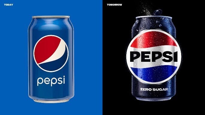
More recently, Pepsi followed suit. Their 2023 rebrand is a callback to their early 1970s mark. The saturated color and bold type pop on the shelf--pulling consumers towards something fresh yet oddly familiar. Of the rebrand, Pepsico's SVP and Chief Design Officer Mauro Porcini said "We designed the new brand identity to connect future generations with our brand's heritage, marrying distinction from our history with contemporary elements to signal our bold vision for what's to come."
Pepsi and Burger King are just two examples, but they show us just how important emotional connection is to long-standing brands such as these. Brand (in a broader sense) is the inherent feeling you get when interacting with a company or product. By pulling in a mark from the past, they're beaconing consumers with "Hey, remember this? Simpler times, right?". By repurposing a retired mark, brands can feel fresh to a new wave of consumers while appealing to the nostalgia of older generations.
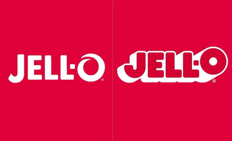
In contrast with pulling us into the warmth of the past, legacy brands might also rebrand entirely to solidify themselves into the future. Jell-O recently did this, leaving behind their familiar san-serif flat wordmark in exchange for something bouncier, more fun, something to "Give Jell-O its jiggle back". The feedback has been generally positive. In this rebrand, Jell-O has reintroduced themselves to a new generation of consumers.
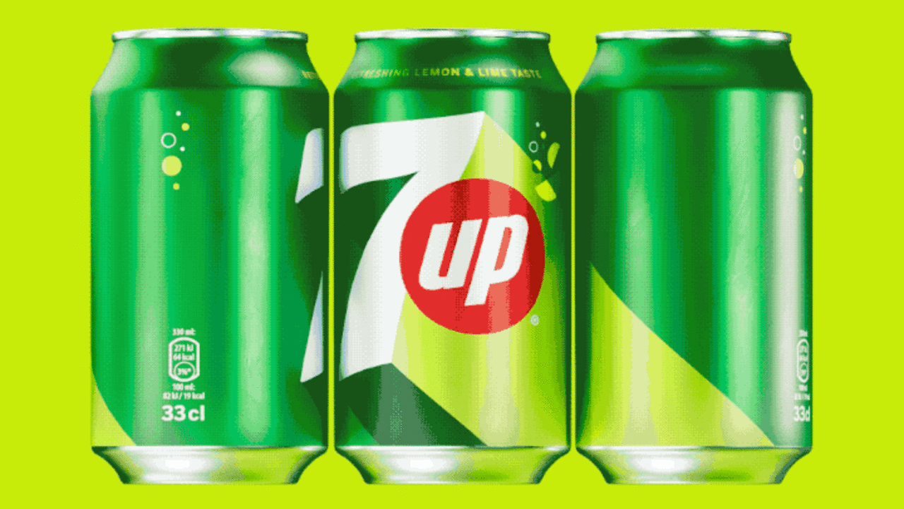
7-Up recently did the same — introducing bright saturation and flat, bold graphics to their previous branding. While still recognizable in many ways to their previous mark, the freshness packs a punch and imbues their brand with a new sense of optimism and fun.
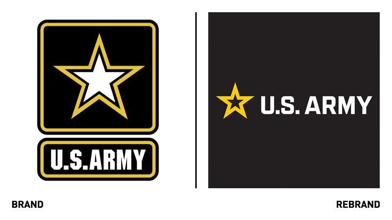
Even the U.S. Army rebranded this year, their first refresh in 20 years. The simplified star mark, clean type, and human-centric approach make sense when you consider their need to appeal to a younger demographic.
These full refreshes exemplify a brand's desire for relevancy. It's an opportunity for a brand to revisit its ethos, its target demographic, and reintroduce itself fully. What they may sacrifice in long-term consistency, they make up for in nuance, surprise, and the opportunity for a clean slate. The challenge for designers amid a full rebrand is to create something new and fresh, but with the staying power that can represent the brand long after a trend has cycled through.
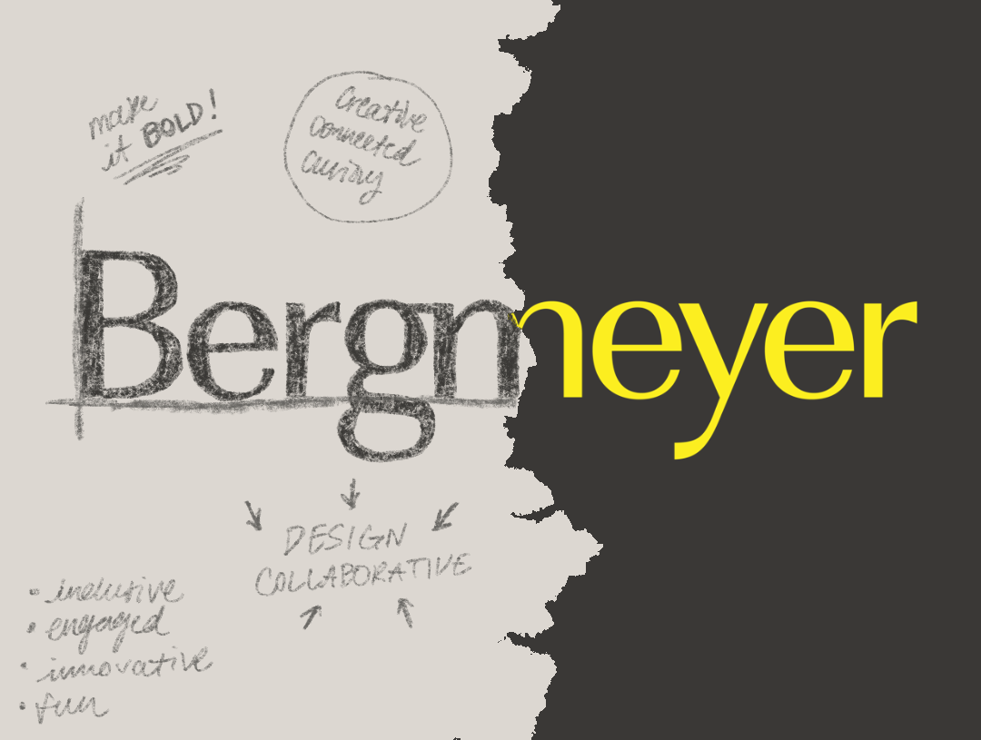
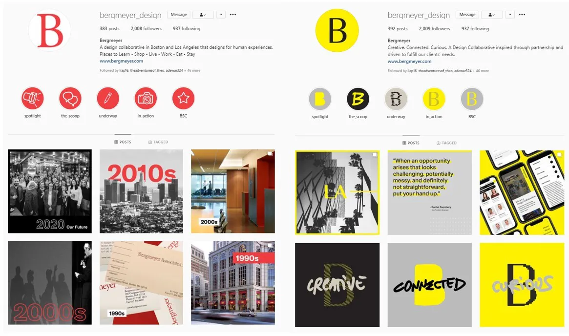
We saw the benefit of a full refresh firsthand when Bergmeyer boldly reintroduced itself back in 2020. As our scope expanded considerably, it felt overdue to stretch beyond the visual identity of a traditional architectural firm. The bold, bright, and fun rebrand more accurately reflected our broader array of services as well as the energy of our company culture. Principal Christian Davies said of the rebrand:
“My first exposure to the new Bergmeyer brand was when Eric Kuhn and I were enjoying a catch-up libation in NYC when he was in town. I was in my previous job at the time and towards the end of the evening Eric showed me the new look and feel through the Instagram feed. It leaped out of the phone at me, strikingly different and very bold. Obviously, it made an impression, given that I work here now.”
Not only did our logo become more refined, but our color, photographic style, typography, and tone of voice got a full makeover. This has allowed us to step forward confidently as a multidisciplinary design collaborative and is a great example of how a full refresh can help a brand step more fully into itself.
When it comes to legacy brands, we've seen it all, with varying levels of success. What are your favorite long-standing brands? And how has their brand grown over time? Let us know at hello@bergmeyer.com!